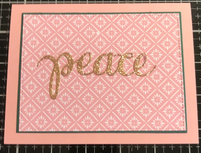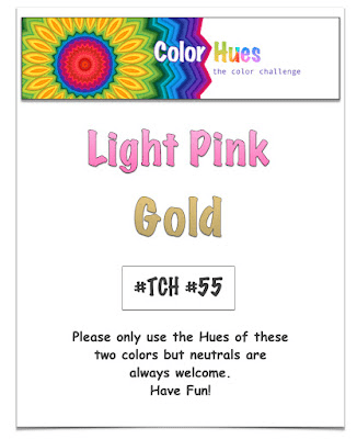
This card took on a life of its own. I was heading in a completely different direction with different layers when I realized – Hey if I put gold on this, it would qualify for the Color Hues challenge to use light pink and gold. The original plan was to use a piece of ephemera that used the word Peace. I ussd gold glitter cardstock from Hero Arts to cut the word Peace, also from a Hero Arts set. Unfortunately the die cut Peace didn’t work with the ephemera, which luckily I hadn’t attached to the card. I had already attached pattern paper from Floral Essentials by Gina K Designs. I attached my gold die cut and decided I liked the simplicity of it.


Beautiful card!
Thanks Diana.
I really like the simplicity too. Very wise to go with what was working for you.
Thanks Bonnie. Sometimes I just have to go with the flow.
I’m with you on the simplicity of this. The paper speaks beautifully and adding the gold sentiment make it look lovely.
Thanks. I’m all about simplicity right now and I seem to be inclined to make cards without stamping.
Simply beautiful!
Beautiful! I agree about the simplicity.
Thanks Gerry
So pretty. I, too, line the more cas look to your card. I’m really liking the pink/gold combo.
Thanks Gayle. CAS doesn’t always mean quick. It took me a while to decide how to create this CAS card.
Judy, this is lovely.
Beautiful! I, too, love the simplicity of your card. The paper you chose is so pretty and goes nicely with your gold greeting.
Perfect! The word says it all! Happy New Year and thanks for joining us at Color Hues!
I love the simplicity with the focus on the sentiment!
I love this elegant CAS design! It makes the challenge colors shine!
Thanks for joining us at Color Hues 🙂
I think you definitely made the right choice with the gold.
Thanks for linking up with us at Color Hues. 🙂