

Did you every have that one idea in your head for a card and no matter what you tried it just didn’t seem to make like you envisioned? Well, my first card (A) is the last of three I made for The Paper Players – Clean and Simple Challenge from Claire with a theme of Fall Fun. After gold heat embossing the Fall Colors sentiment from an older Inkadinkadoo stamp sent, I then used the SSS leaf stencil and several colors of Distress Oxide ink to complete the card. Layered it on a blue and adhered to the kraft card base. Hmmmm!!!!
Here are cards B & C:
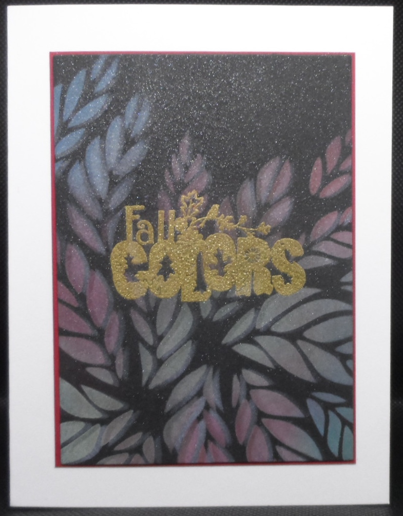
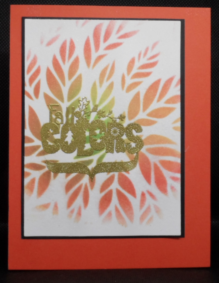
The same colors of Distress Oxide inks were used on cards A & B. Card C I stayed with the orange, yellow, green shades. Card B is on black cardstock and after inking with the distress inks, I shifted the stencil slightly and added white pigment ink. It has a blurry look to me so maybe I should have did the white pigment then the color. At the end I just sprayed all three with my perfect pearls/water mixture and added to card bases. What do you think? Maybe they will grow on me. Suggestions welcome.
Thanks for stopping in for a peek. Rain tomorrow so hopefully I can spend more time making cards.

I think all three are lovely. Possibly the black one would be brighter if you started with the white ink and let it dry, then add the color, like the black magic feel. Quite lovely the way it is, though.
Thanks, Lisa, I was thinking that I should have applied the white pigment ink first. I appreciate the advice.
I like them all. The first card is very festive and definitely displays fall fun. Card B has a rathe ethereal, ghostly look. Card C has the feel of autumn.
Thanks for the confidence builder Judy. You are good for my soul.
Not sure what you had in your head? They seem a bit flat, maybe try dry embossing after you have added your colors with a shim at the sentiment so it doesn’t get embossed? For sure the shimmer did add a detail we can not appreciate here. I would maybe even go in a draw around the stencil with a thin black marker for contrast.
Thanks for the tips Bonnie, I appreciate them. I’m going to shake out the dust in my head and get inky again. lOL
Gayle, love all three cards – think I would have matted the sentiment so easier to see, maybe even on vellum. They are all beautiful as they are!
Gayle, each card seems to embrace a different season! Love them all! Way to push through your vision as they are all so pretty! We appreciate you joining us at The Paper Players! Take care!
Gayle, all three are very lovely fall cards. They all give off a fall fun feeling.
All of these are really pretty Gayle. I really like the colors and what different looks you got on all 3 of them.
So pretty! I love all the beautiful colors! Such pretty fall cards! So happy you joined us at The Paper Players this week!
So pretty! I love the different variations you created, too. Thanks so much for joining us this week over at The Paper Players!