
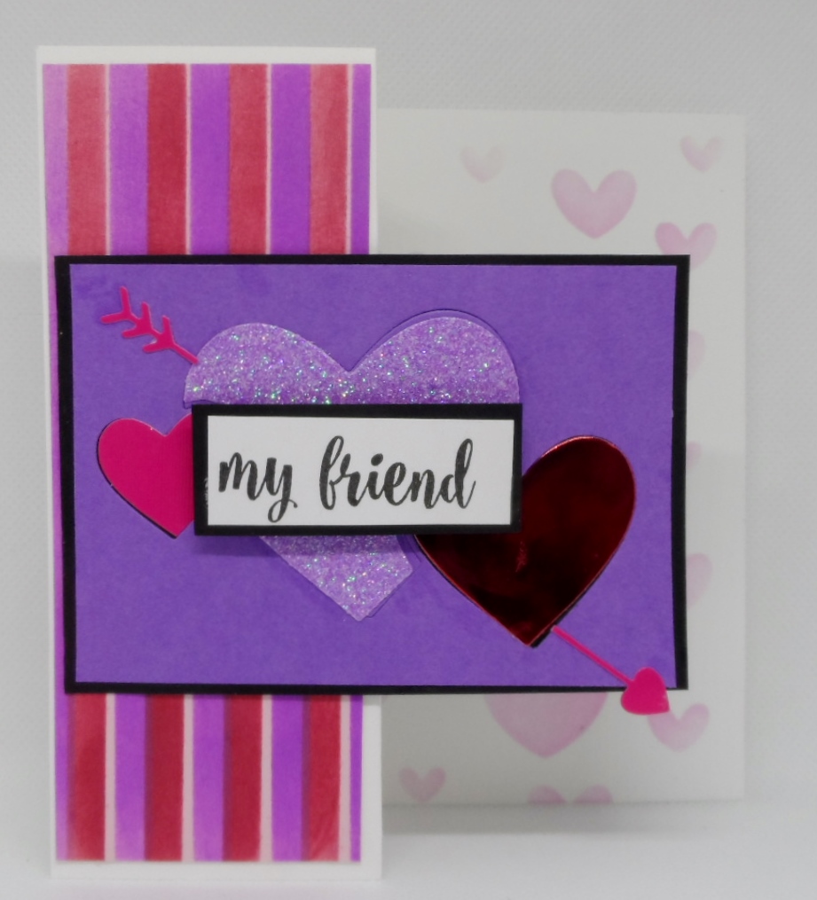
My card today was going to be entered into the Just Us Girls Challenge #519 color week’s colors of Purple, Pink and Red however not sure if it’s our site or theirs but I cannot upload to their challenge. But all is not lost since the As You See It Challenge Challenge #217 “Love is in the Air” should work for this card. Fingers Crossed that it works. Anyway here are the details of my card: my striped background on the fun fold was made using Pretty Pink Posh’s striped stencil in distress inks on a light pink cardstock. The inside was stenciled in light pink with Pretty Pink Posh’s layered hearts stencil. The center die is Birch Press Designs Floating Hearts Die which I cut in the wild lilac and then again in hot pink, glittery purple and shiny red papers, the arrow is Penny Black’s sweet heart die set and the sentiment is from GKD’s Better With You stamp set. Thanks for stopping by to take a peek.

What a great way to use these colors and make them happy.
Thanks for the support Bonnie. I wasn’t able to link it to JUGS as for some reason my card didn’t show up just some little box-thing. So anyway I removed the links to JUGS.
Wow – this has such visual impact and those colours work perfectly for this design. This is a wonderful card and I love it.
Thanks Johanna. Even though I like color and normally go overboard with it, I quite like how it turned out.
Beautiful card! Love how you combined the colors!
Thanks, Diana, I’m enjoying making some Valentine cards although I was a little worried on the outcome of these colors.
Pretty card! The link at JUGS looks the same as other blogs. Must be some kind of glitch. Glad it fit the other challenge as this is a lovely card.
Thanks Lisa. I just tried again and for some reason every picture on my post is showing except the card. Not sure what the issue is but no problem.
Beautiful card Gayle. You put those colors together so well. I love how the purple really stands out.
Thanks, Gerry, I wasn’t quite on the colors but was happy with how it turned out.
It totally works, Gayle! It reminds me of the Red Hat Society, mixing the reds and purples! lol But I’ve always thought those colours look great together anyway! I like the fun fold and all the different hearts and the way you mixed your patterns! Thanks for sharing it with us at As You See It Challenges!
Thanks so much for your comments. I look forward to your challenges.
I like the way that you’ve stencilled the softer colours on the back panel. With the stronger versions on the front, it really creates a sense of depth when you’re looking at the card. I like the boldness of your colour choice – those colours do look well together, even when my head says they shouldn’t! Thanks for playing along with us again at As You See It Challenge.
Gayle, this is a fun card! Those stripes are bold, but beautiful and are perfect with your main image. I love your fold and how you used softer hearts that show from the front, but carry your design inside. Great work!