

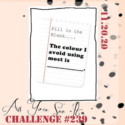
The challenge for the As You See It Challenge blog is a fill in the blank: The color I avoid using most is ________. and then use that color. GRAY!! I normally do not use gray and I don’t wear alot of gray either as I am “tawny spring” on my personal color wheel which are more warm tones. I did finally find some nice gray shades of cardstock from GKD in Stormy Sky and Slate. My white snowflakes were die cut using a Tim Holtz Sizzix die and the top is one that GKD sold at one time and I cannot remember the name of the company. Anyway there is a snowflake in between the two die cuts from a 2017 StampTV kit which was stamped and heat embossed in silver (kind of gray). The background was created using SU’s Snowflakes stamp set and clear embossed. Merry is part of a Penny Black sentiment die that I cut apart from the Christmas and the Christmas stamped and white embossed is a SSS Christmas sentiments set. Since I cannot just use the gray my red card stock was calling my name!
Thanks for looking. I’m in Christmas card making mode and am halfway completed and they may get in the mail by December 1st or maybe not!
Stay Safe.

Beautiful. I would never think of gray for Christmas cards but you really made it work.
Very pretty! I love the gray. I would not think of it for Christmas but it works.
Love the card! I am a gray person! Maybe it is just my age! Haha!
This is fabulous! The pop of red really brings the card to life, but had there not been so much gray that pop would have been totally lost. I used to think gray wasn’t my colour either, but I’m coming around to it. Thanks for playing along with us again at As You See It Challenge.
That is too funny because gray has always been way up there on the favs list for me. Especially dove gray. Had a silk blouse once and I wore the thing out.
I love gray but don’t often use it in my card making. You really made it work and the pop of red is just right.
This is so pretty! The gray, silver and white is perfect for a winter card, and that pop of red looks great with it! Love the tone on tone background you created with the clear embossed snowflakes.
This post is great! Keep up the good work!
I always think that gray with pops of red and white are Scandinavian colours. This looks really Christmassy in a Danish kind of way! Thanks for joining us for our Not My Jam challenge at As You See It Challenges, Gayle!
I’m with Diana on loving gray. You did a fantastic job with a color that just isn’t your jam. The red really does pop, which draws your attention down to the Christmas. Great job on this!
I love the grey background you chose Gayle and the red sentiment was a great addition to really bring the whole card to life. Great job! Thanks for sharing with us over at As You See It this week!
Thanks so much and for another fun challenge.
Well, you certainly used gray to its best advantage here…silver and white stand out nicely, and those snowflakes are beautiful! We are glad you pushed through your dislike of gray to play with us at As You See It this week!
Thanks so much. Love the Challenges at As You See It.
That pop of red works so well on the gray pieces and I love your snowflakes. A wonderful card and I chuckle at your comment on not being a gray person – I’m the same with brown.
LOL..Johanna…I chuckled to myself when I saw your brown card. Now brown is a good red head color. Thanks for commenting.