
I had time to create a card for the As You See It Challenge. I will also apply this to the Simon Says Stamp Anything Goes Wednesday challenge.
https://www.simonsaysstampblog.com/wednesdaychallenge/simon-says-anything-goes-94/
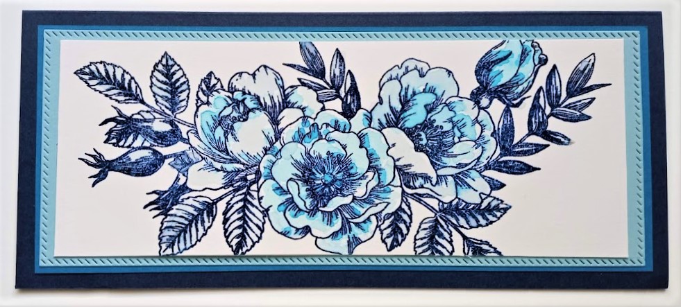
I used a Simon Says Stamp image Beautiful Flowers, which I watercolored with Gina K Designs Blue Raspberry and Powder Blue. I stamped with Versamark and In the Navy Ink, embossing with clear powder. After the ink dried, I cut the paper down to fit on these pieces of cardstock. I began with slimline dies, but ended up cutting them down a bit, so the cardbase ended up being 8 1/4 inches long. The base is SU Night of Navy cardstock, with layers of Pacific Point and Balmy Blue. I am sure I have those exact colors in two of the inks and most in colored pencils, but my GKD inks were handy and they worked well. The slimline dies used were Picket Fence Studio.


BEAUTIFUL!! Love the layering and your amazing coloring of the flowers.
Thank you! I enjoyed sitting and coloring today. This was easy to paint.
SO very cool that you are painting with inks. Not sure if you used the pad or re-inkers but it sure creating a stunning piece.
I just use the pad placed on a block. First I watered it down, then came back with more of the pigment. This was easy to color, so enjoyable. Funny thing is that I have actual paint, but rarely get it out as the ink is always handy. Thanks!
Beautiful!
Thank you!
Such pretty flowers, Lisa – I love this cluster and the details! They look fabulous in blue! Thanks so much for playing at As You See It!
Thank you! My buddy Gayle was encouraging me to give these colors a try. I am glad I did. I enjoyed creating with the blues.
Beautiful blues and watercoloring for your floral design. That slim line die edges really give additional interest to the layering. Love this card, Lisa. So glad you played with the blues.
Thanks! So glad you created and I followed your colors. I enjoyed the blues.
This is a stunning design which is also beautifully executed. Fabulous! Thanks for joining in with us at As You See It Challenge.
Thanks!
Lisa, this is beautiful! Blues are usually a great color to use. I’m with Gayle on that edge of the lightest blue piece adding a lot of interest. Beautiful job coloring the flowers, too. Pull out your paints once in a while, as you get a different look with them than just coloring with the ink. Plus, the texture you get. Texture is ALWAYS good.
Thank you! The paints are actually a large process to get to these days. I may take the time to get them more available and use them.
This is gorgeous and your colouring is a delight to see. I agree with both Gayle and Golda about the lightest blue piece. It makes a huge difference to the overall result.
Thank you! I enjoyed creating with these blues.
What a gorgeous floral display, Lisa! Those blues were a perfect selection! You added just the right amount of colour in your blooms. Thanks for getting colourful with us at As You See It Challenges.
Thank you! I enjoyed working with the blue colors.
Lisa your beautiful blue roses are gorgeous and I love the slimline design too. Thanks for playing with us over at As You See It this week!
Thank you!