
Just when I thought that I had all of my January birthdays covered, I realized that those closest to me also have January birthdays. My daughter in law the beginning of the month and son in law at the end of the month with our granddaughter squished in the middle of the month. Do you think this could be feminine or masculine??
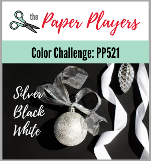
Claire from The Paper Players is challenging us to use the Color Challenge PP521 colors of Silver, Black and White.
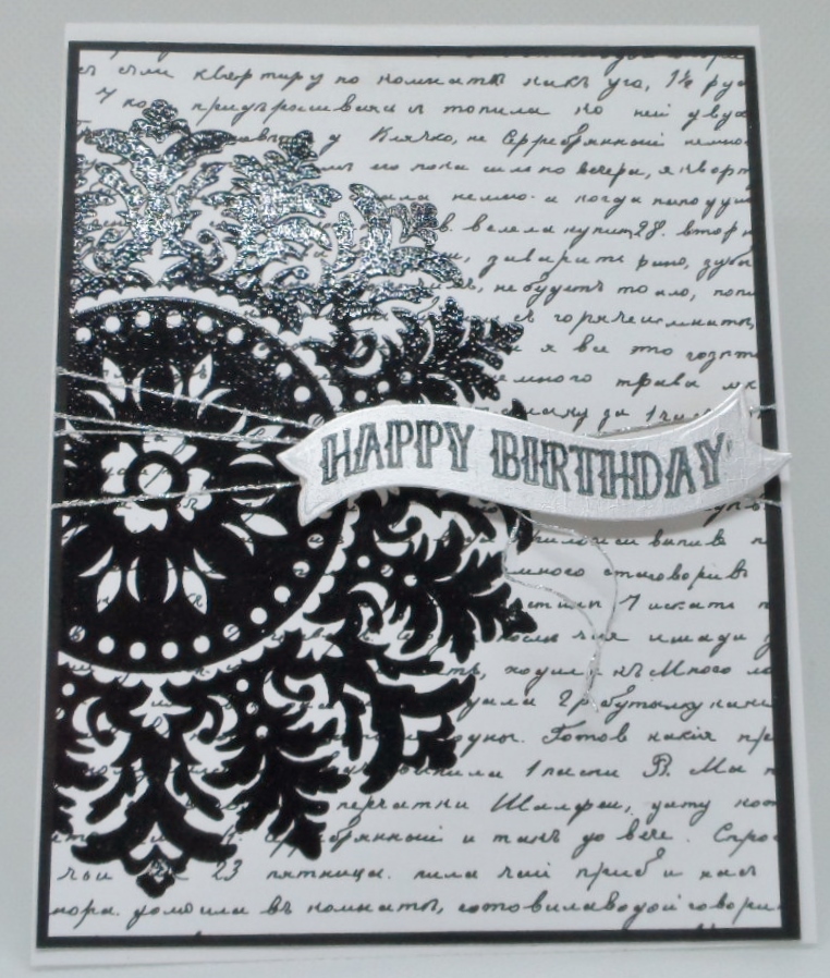
So after googling some options, I cased my card off of Pinterest….sorry lost the original post but I used my Stampin Up “Medallion” large background stamp, Gina K Designs Petite Patterns patterned paper, Hero Arts Ribbon Messages Stamp & Cut and Recollections Foil cardstock paper. The patterned paper can also be foiled but opted to keep it natural because I wanted to stamp the medallion on top of the paper and didn’t think it would work on the foil. My image was stamped in Versamark black ink and clear embossed, mounted on a black layer, added some silver thread and the banner was die cut from the silver cardstock and stamped once again in the versamark black and clear heat embossed.
Feminine or Masculine that is the question???

I think feminine based on the curved sentiment strip. Lovely card!
Oh good, Lisa, since I made it for my DIL. Thanks for your advice.
Now I go the other way based on the color scheme. Seems masculine to me. Defiantly can go either way. Very good job of getting the look/feel of the challenge.
Very cool card I would lean toward it being a feminine card. I like the medallion, but it does look a little flowery for a guy.
Beautiful card – I would go feminine – but could go either way!
This is so pretty! Glad to see you stepped out of the box with a birthday card! I vote feminine! Love that big medallion!
Thank you for joining my color challenge at The Paper Players this week!
Beautiful card, Gayle! I LOVE the bold medallion. I believe the card could be either masculine or feminine, by switching out the sentiment. Keep the curvy sentiment for a feminine card. For a masculine card, add a “straight” sentiment down in the lower right corner. I had forgotten how dramatic the Medallion background stamp was. I am sure your DIL will love it! Thank you for sharing with The Paper Players this week.
This is beautiful! The medallion is so striking; ornate but not too flowery. I really think it could be masculine or feminine. I agree with Ann – a straight greeting might make it more masculine, but the colors make it work for both.
Wow – I just uploaded another card here and then the medallion caught my eye and I followed the link even before I realized it was yours Gayle. It is a fabulous card and like everyone else I feel it could go either way. That said, I do lean more to feminine. The design and colours work for both. You do beautiful work my friend.
This is SO beautiful Gayle. I too think it could go either way but I lean more toward feminine with the curvy sentiment.
Gayle, this is a great card and could definitely work for either. Personally, I think guys would like curvy sentiments, as well, think gears, wheels, etc. I’m sure your DIL will love it.
Love that large medallion image stamped over the script background. Your card is elegant and perfect for either man or woman – no doubt your DIL will love it! Thanks so much for joining us this week at The Paper Players!